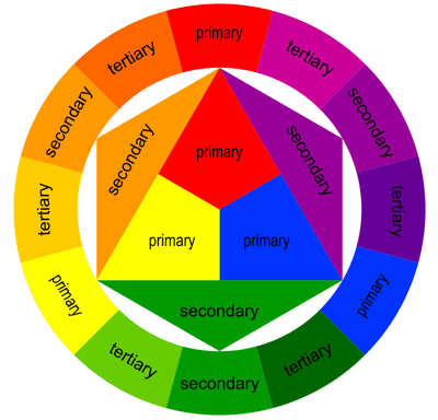
The basic principles of colour theory consist of a range of different colour schemes and contrasts. Primary Colours are red, yellow and blue and are the three pigment colours that cannot be mixed or formed by a combination of other colours. The Secondary Colours are green, orange and purple and are created by mixing the primary colours together. Tertiary Colours are yellow-orange, red-orange, red-purple, blue-green and yellow-green and are formed by mixing a primary and a secondary colour together.
The monochromatic colour scheme uses variations in lightness and saturation of a single colour. Monochromatic colour schemes look presentable together, however may be considered boring unless there is diversity within the design. The complementary colour scheme consists of two colours that are opposite each other on the colour wheel. This scheme is typically used with one warm colour against a cool colour, for example, red versus blue. The triadic colour scheem uses three colours equally spaced around the colour wheel. It offers a strong visual contrast, however it is not as contrasting as the complementary scheme. The analogous colour scheme uses colours that are adjacent to each other on the colour wheel. One colour is used as a dominant colour, while others are used to enrich the scheme. The analogous colour scheme is similar to the monocromatic. The more an object contrasts with its surrounding field, the more visible it becomes. Some combinations are difficult to read due to the low level of contast between figure and ground. When creating visuals that are intended to be read, it is vital that there is enough contrast between the text and background to ensure that the viewer can understand the text.
A person who is colour blind cannot perceive the difference between certain colour combinations. Red-green colour blindness is the most common type in cases, however it does not mean the person cannot see the colours red and green. People with red-green colour blindness have a more difficult time differenciating between the two colours although not all reds and greens are indistinguishable - a lot depends on how dark the colours are. Whilst there are several different types of colour blindness, Rod Monochromacy or achromacy - where the cones of the eye are non-functional, meaning a person cannot see any colour at all - constitutes to an extremely small minority among people who are colour blind. These people see in black, white and shades of grey and usually have poor visual acuity and have an aversion to bright light.
Designing for Colour blindness:
The key to designing something is to ensure that colours are not your only method of conveying important information or a message. Most things on the web are in colour, however it is not vital that they are in colour as the majority of the time the colours do not convey a message that is important or of use to the viewer, however if the purpose of posting something is to communicate something about the colours, then it is important to provide another way of colour blindness people to understand the information. For example; the colour scheme and key used on the London Underground system to distinguish train lines and stations are vital, however a colour blind person would be unable to understand the routes because it solely relies on colour.

No comments:
Post a Comment